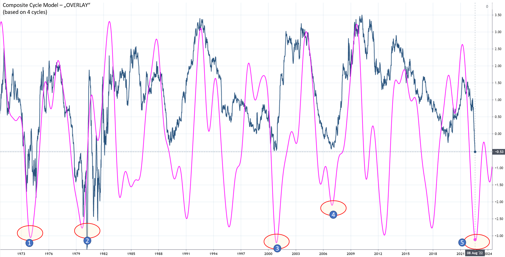
The following chart shows the 10 year US treasury minus the 1 year treasury spread curve in blue. The current yield curve is negative which results in an inverted yield curve. Attention is keenly focused on the yield curve slope as sustained inversions in past decades have been followed by economic downturns over the ensuing 12 to 18 months.
We have applied the cyclic model and have gathered 5 dominant cycles in the treasury spread. The detected five cycles form a composite model and are overlayed in fuchasia in the chart below. The cyclic model is able to predict major turns in the yield curve. Proposing a cyclic turn might be around the corner. As indicated at point #5 on the chart.

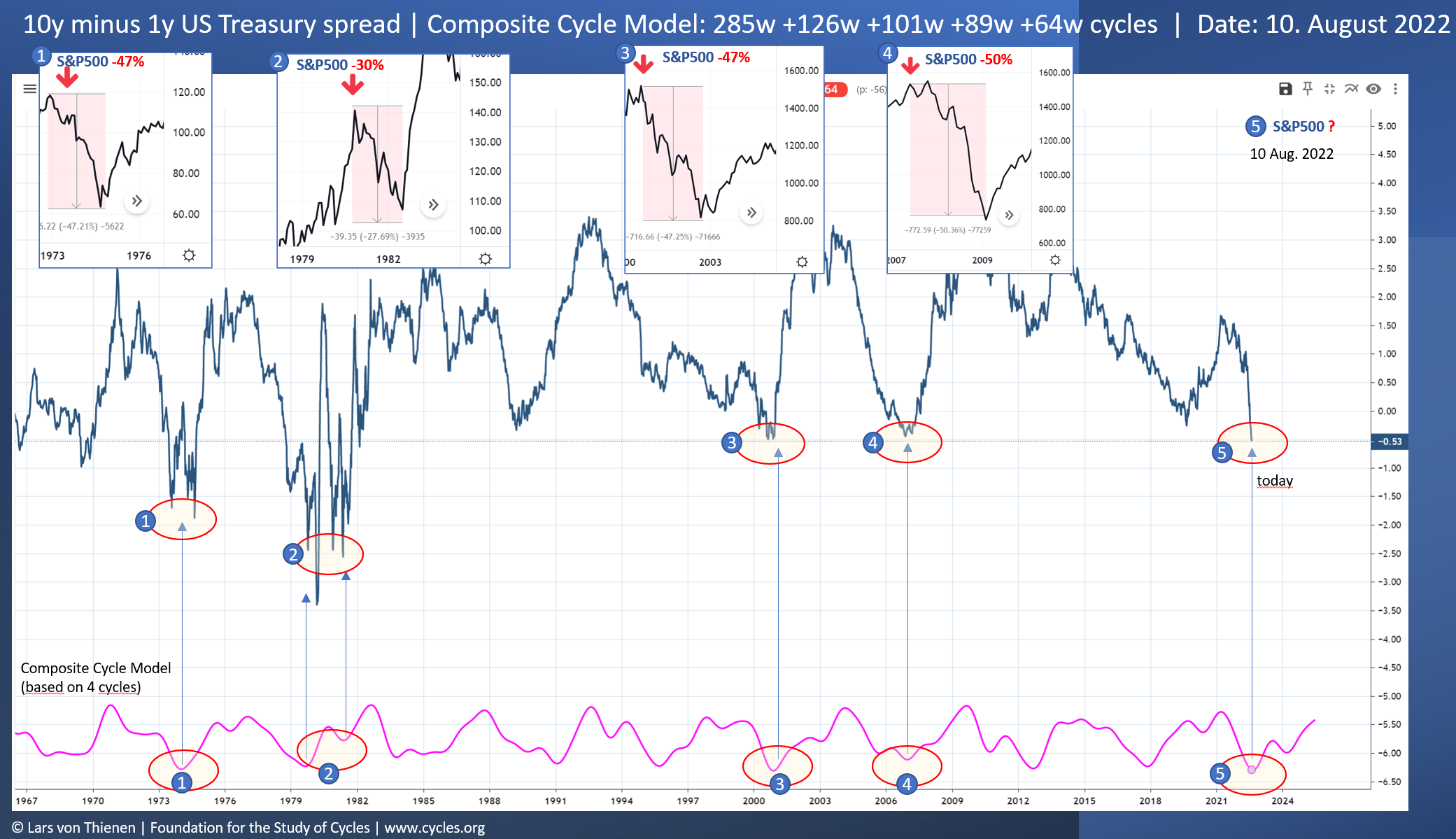
The current inverse yield curve and the underlying cyclic model is extremely bearish – with a near perfect track record for predicting major bear markets long before they break out. The last few times the inverse curve trend reversed, major bear markets followed.
The following chart shows the same cycle model shown as “indicator” below curve. I have highlighted the points 1-4 in the past model where markets dropped between 30-50 after these turns:1: The bottom turn 1973 was followed by a drop in the S&P about -47%2: The inversion reversal 1980 caused a downturn of -30%.3: The 2000 bear market with a drop of 47% was in alignment with the cyclic model turn.4: The 2007 bear market with -50% in the S&P index was seen be another yield curve inversion cycle turn.Today, at point 5, the 2022 yield curve inversion cycle model can likely signal another possible bear market ahead.
The upside potential might be another 5-10% in the S&P until September. But the downside risk according to longer-term weekly cycle models is very bearish with a potential drop of -50%.
Be prepared.
This article a a republishing of the Substack article of the same title authorised by Lars von Thienen on 11th August 2022


